Adding Controls to a Screen
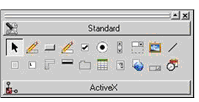
Once you have set the basic properties for your screen, the next step is to add functionality by placing screen controls on your screen. A control is a screen element used to provide information to the user and/or receive input from the user. In the Screen Designer, you add controls to a screen form by selecting them from the Screen Component Toolbox and drawing them on the screen.

Control icons may be viewed in a list with labels or as bitmap push buttons with pop-up hints. To toggle between these views, right-click in the Screen Component Toolbox and select List View.
In addition to the Selector, a Menu Designer, and a Toolbar Designer, the toolbox contains the following standard controls for graphical screens:
- bar
- bitmap
- check box
- combo box
- date entry
- entry field
- frame
- grid
- label
- list box
- push button
- radio button
- scroll bar
- status bar
- tab
- tree view
- Web browser
Character-based screens cannot include the bitmap, date entry, grid, status bar, tab, or Web browser controls. When you work in a character screen, the Screen Component Toolbox icons for these controls are disabled.
The Screen Component Toolbox also has a section for the ActiveX controls that you want to use in your screens. ActiveX controls are available only for graphical screens. More information about the addition of ActiveX controls to your Screen Component Toolbox can be found in ActiveX Controls.